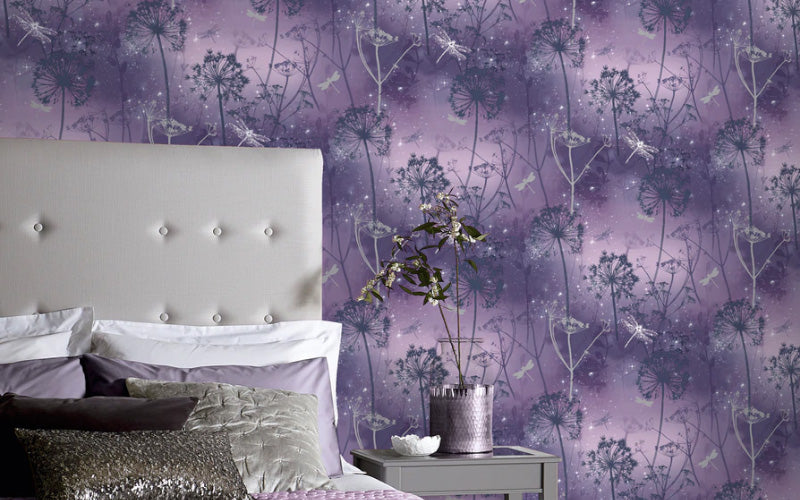
Pantone color of the year 2022

Every year home and interior enthusiasts eagerly await the latest color trend from Pantone and this year was no exception. Taking the world by surprise Pantone has created a new color for the first time in the history of its critically acclaimed educational color program.
Introducing PANTONE 17-3938 Very Peri - it's the perfect combination of blue with violet-red undertones.

Pantone’s latest color displays a spritely, joyous attitude and dynamic presence that encourages courageous creativity and imaginative expression. As we emerge back into a world that has changed so much after a challenging couple of years Pantone’s Very Peri places the future ahead in a new light.
Laurie Pressman, Vice President of the Pantone Color Institute said “As society continues to recognize color as a critical form of communication, and a way to express and affect ideas and emotions and engage and connect, the complexity of this new red-violet infused blue hue highlights the expansive possibilities that lay before us”.
Very Peri color palettes and our wallpaper
To celebrate its versatility Pantone has created four unique color palettes featuring Very Peri to help bring this year’s special shade into your home. So let’s take a look and how that could work with our range of wallpaper:
Balancing Act

Credit: Pantone
As the name suggests Balancing Act is a complementary palette of color whose natural balance of warm and cool tones supports and enhances one other. Our Highgrove Floral Blush Pink Wallpaper with its pink and green tones would work perfectly alongside the liveliness that Very Peri brings.
Wellspring

Credit: Pantone
Many interior experts have tipped green color schemes to be a popular trend in 2022 as their natural tones help bring a sense of calm and balance indoors. The Wellspring palette is a holistic and harmonious blend of nature-infused shades that highlight the compatibility of the greens with good-natured Very Peri, and the health-giving properties of these deliciously subtle and nourishing hues.
Our Pindorama Navy wallpaper would be the perfect pairing in this palette with its botanical print that highlights the energy that Very Peri brings to a space.
The star of the show

Credit: Pantone
For those that prefer a more understated palette, The Star of the Show is just that. The pop of color that Very Peri brings is balanced with a color scheme of classics and neutrals whose essence of elegance and understated stylishness convey a message of timeless sophistication. Our Banana Palm Coffee wallpaper would work well in this scenario. This wallpaper will bring out the cool tones of blue hidden within Very Peri while adding style to your home.
Amusements

Credit: Pantone
This palette is a real celebration of color and the joy it can bring to people’s lives and our Passion Flower White wallpaper is what the Amusements palette is all about. It’s a joyous and whimsical color story of irrepressible fun and spontaneity.
In fact, it’s this type of boldness that is at the heart of the inception of Very Peri, encouraging us all to be a bit more experimental with color to express ourselves.
Take a look here for more inspiration on how to use wallpaper to create an impact within your home.
